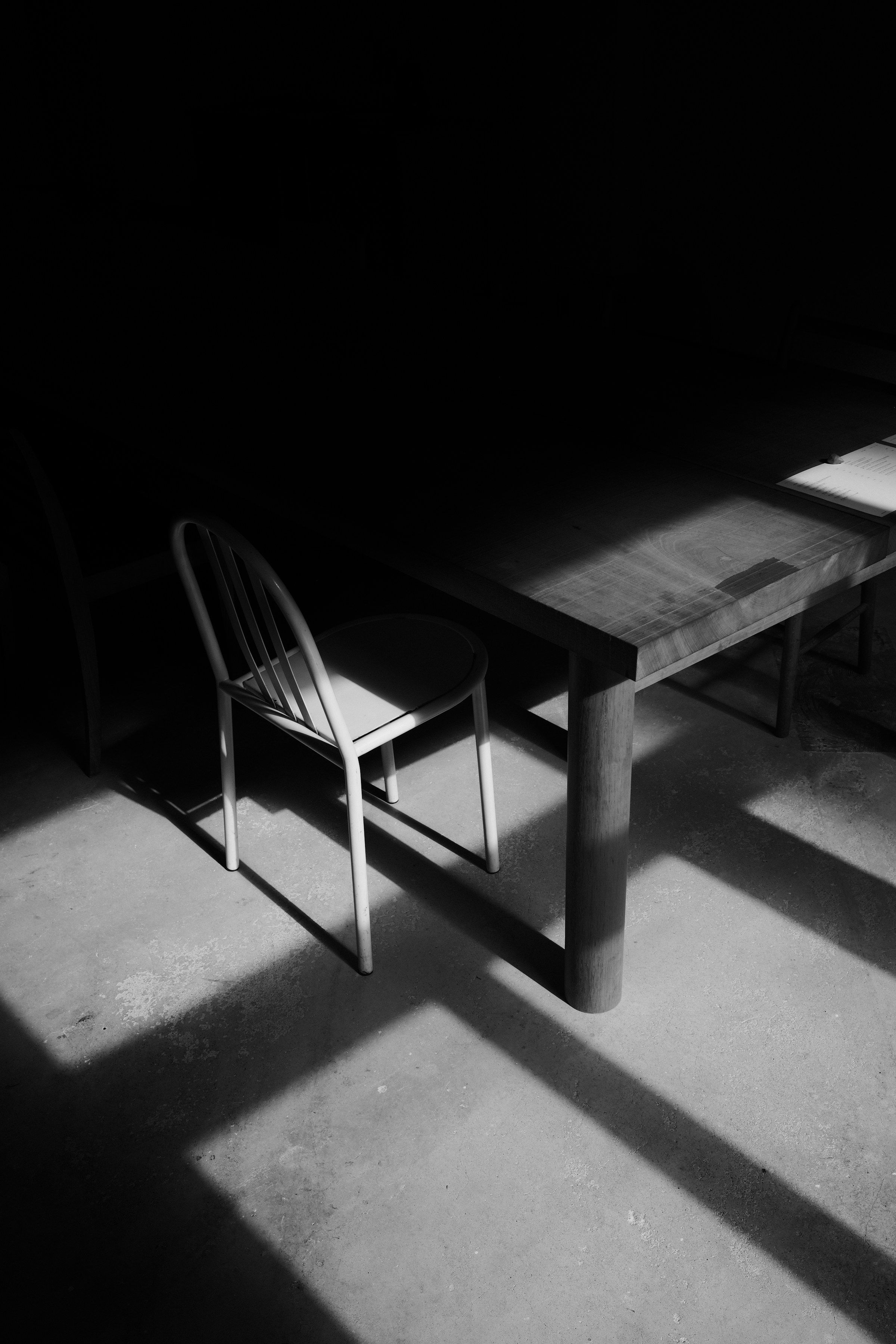
Much of contemporary design is built around visibility. Spaces, products, apps and visual identities compete to capture attention within the first few seconds. In a social feed, the ability of an image to stop the scroll, a shopfront to announce itself from a distance or a new object to look immediately “different” can become a measure of success in itself. In that environment, design can easily be reduced to saying as much as possible, as quickly as possible.
Yet strong design does not always speak loudly. Its effect can come from saying less: proportion, controlled space, material clarity, precise detailing and the removal of what is unnecessary often last longer than a dramatic gesture. Looking impressive at first sight and continuing to feel natural, legible and comfortable over time are not the same achievement.
Quiet is not absence
Not every surface in a room needs a separate idea. Not every technology in a product has to be visible, and not every area on a page needs to be filled. When design recedes in certain places, what matters becomes easier to perceive. Quietness, in this sense, is not emptiness but hierarchy.
A good room is formed not only by the objects it contains but by the space left around them. A good page depends not only on the letterforms but on the distances between lines and margins. A product is not less capable because every function is not exposed; if it reduces the burden of decisions on the user, it may be more mature. Quiet design redirects attention from itself to the experience it enables.
Good design often does not explain itself; it is felt because it works.
Why simplicity is difficult
Simplicity can appear easy from the outside. Fewer materials, fewer colours, a clean plan or restrained typography may seem to require fewer decisions. In practice, good simplicity is not a reduction in decision-making but a stricter selection of decisions. To leave something out, one has to know why it does not belong. Making a detail disappear often requires resolving it more carefully.
For that reason, junctions, door frames, skirtings, lighting positions, material transitions and proportions become more important in a quiet interior. When decorative layers no longer distract the eye, weak detailing becomes easier to see. The same is true in graphic design: a page built with two typefaces and generous white space will reveal a small alignment error immediately.
The distance between character and spectacle
Quiet design does not have to surrender character. Many enduring examples are instantly recognisable. They possess their own proportions, rhythms and material language. But that character is not created through a constant demand for attention. A strong timber surface, stone that ages well, a carefully placed piece of brass, a shadowed junction or daylight changing through the day may be enough.
The distinction is between design that says “look at me” and design that says “notice how it feels to be here.” The first can create a powerful image; the second accumulates meaning through use. A thirty-second image and a ten-year experience cannot be judged by the same criteria.
Time tends to favour quiet design
Spectacle is often tied more closely to the visual codes of its period. Balanced, quieter work leaves more room for change. Furniture can be replaced, technology can evolve and patterns of use can shift, while a well-proportioned space or a clearly structured system can continue to accommodate them. Quietness is therefore not only an aesthetic choice but also a question of flexibility and longevity.
One of the clearest signs of refinement may be the ability to create character without displaying the effort behind it. The user may never know how many decisions were resolved in the background, but will feel the resulting calm, ease and coherence. That is often where design becomes mature.
Everyday use is the real test of quiet design
It can be misleading to judge the quietness of design from its first photograph. The real test appears in everyday use: a drawer that makes the hand fall naturally in the right place, lighting controls that need no thought, a menu in which information is found without hesitation, or a chair that lets the body discover a comfortable position immediately. These may look like small achievements, but they define experience.
Such successes often go unnoticed precisely because they do not foreground the designer’s signature. That invisibility is not failure. It can be evidence that design is no longer competing with the user. Quietness is the point at which design recedes enough to make room for life.
The opposite can also be seen in objects and spaces that demand constant attention: doors that are awkward to open, icons that require interpretation, automation that needs continual adjustment, furniture that photographs well but is uncomfortable, or surfaces that look perfect while being impossible to maintain. Their first impression may be strong, but daily life quickly erodes the effect.
Quietness also has a cultural dimension
What feels “excessive” or “quiet” changes with culture, period and context. The density of pattern, colour and objects in a Mediterranean house cannot be judged by the same formula as a restrained Northern European palette. Quietness is not a fixed aesthetic style; it is the ability of elements to leave room for one another within their context.
Quiet design therefore does not have to be beige, empty or minimal. A colourful, layered interior full of historical references can feel calm when its hierarchy is clear. Conversely, a white room with few objects can feel unsettled if its proportions are weak. Quietness comes less from the absence of things than from decisions that do not compete unnecessarily.
The quietness of good design is not about doing less; it is about carefully silencing what is unnecessary so that the right things can be heard.