Cinema
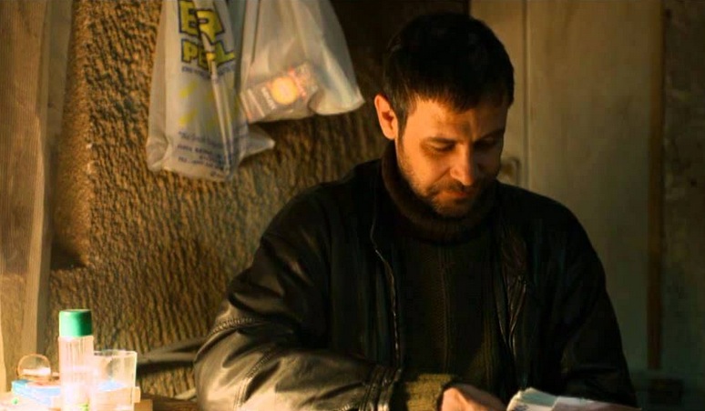
This scene is one of the moral as well as dramatic centers of Winter Sleep. Nihal’s attempt to compensate for an injustice through money appears charitable on the surface, yet it exposes the fragile relation between class, conscience, dignity and power. When İsmail burns the money, he is not simply refusing assistance; he is rejecting the hierarchy embedded in the gesture, the delayed mercy and the humiliation that accompanies it. The scene refuses easy emotional comfort. Its force comes from the fact that no one is fully innocent and no one is entirely wrong.
What makes the sequence unforgettable is the way it creates enormous pressure without slipping into melodrama. Camera, space and performance work together to make the tension palpable. Money becomes more than an economic object; it carries guilt, anger, pride, class resentment and the desire for moral repair. The fire consumes not only the banknotes, but also the possibility of easy reconciliation.
The moment gains its full power because Ceylan stages it not as an isolated incident, but as an eruption of accumulated silence, shame, resentment and arrogance. İsmail’s action may appear irrational, but that irrationality is precisely what shows that dignity cannot be reduced to economic logic. It remains one of the clearest and most disturbing representations of class and moral injury in contemporary Turkish cinema.
Music
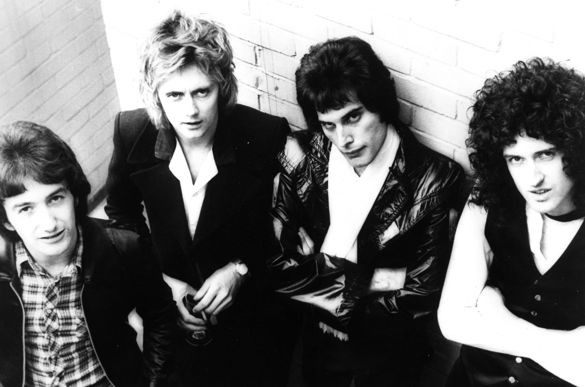
Spread Your Wings is not among Queen’s loudest or most spectacular songs, and that is exactly why it stands apart. Written by John Deacon, it takes seriously the quiet drama of an ordinary person trying to move beyond the limits assigned to him. Sammy is not a heroic archetype; he is someone trapped in a small life, told by authority that he lacks ambition. The song’s achievement lies in treating that modest desire for freedom with real gravity.
Musically, the track pulls back from Queen’s more theatrical extremes and builds something more measured and intimate. Freddie Mercury’s performance is powerful not because it is extravagant, but because it feels deeply committed. The chorus rises less like a slogan and more like the emergence of suppressed will. Deacon’s compositional intelligence is evident in the song’s structural clarity and melodic restraint.
Lyrically, it is both personal and social. Sammy’s story belongs to one individual, yet the dismissive voice of the boss and the sense of being held in place belong to a much wider world. That is why the song remains affecting: it turns freedom into a lived emotional problem rather than an abstract ideal.
Design
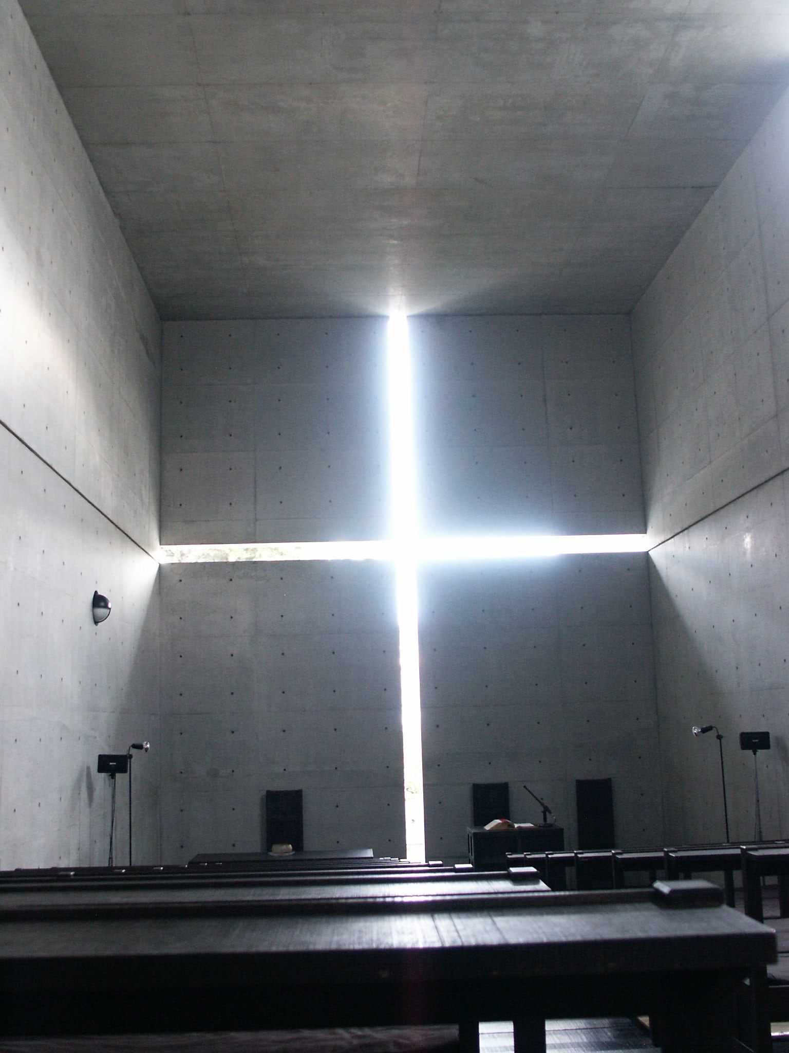
Church of the Light is one of the clearest demonstrations of Tadao Ando’s ability to achieve great intensity with very few means. The essential point is not simply the aesthetic use of concrete, but the way concrete becomes a frame for light and light becomes a spatial and almost spiritual event. The cruciform opening in the wall is more than a symbol: it structures the room, sharpens perception and places the visitor at the meeting point of the material and the immaterial.
What Ando achieves here is a sacred atmosphere without relying on ornament, iconographic abundance or material richness. Instead, he works through proportion, void, surface and illumination. The silence of the concrete intensifies the presence of light; the wall is not background, but an active partner. The building’s power lies in its ability to make a seemingly reduced vocabulary feel emotionally expansive.
Its importance is not that it looks minimal, but that it uses minimal means to generate a layered sensory and intellectual experience. It remains a lasting lesson in how architecture can produce awareness rather than merely form.
History
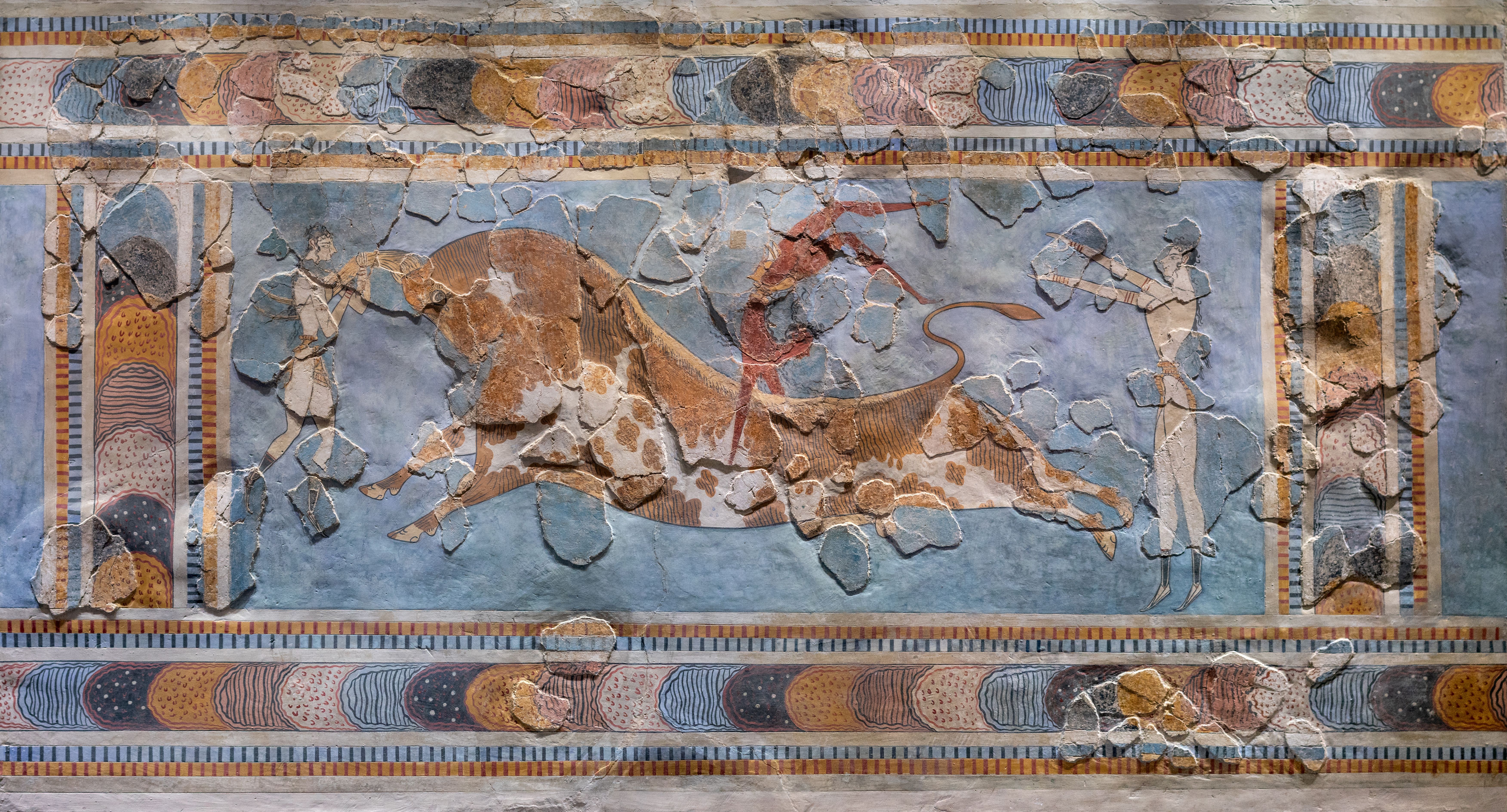
The Minoan fresco, especially the bull-leaping scene, is a remarkable reminder of how sophisticated image-making could be in early civilisations. What remains striking is not only its antiquity, but the continued vitality of its rhythm, motion and composition. The arrangement of figures, the tension of the bull and the use of colour show an image that is not merely descriptive, but ceremonial and symbolic.
The fresco does more than record a scene; it implies a worldview. Human bodies, animals, ritual and power meet on a single surface. That is why it should not be read as an archaeological object alone. It is also an early form of public representation and visual order. Even after time, damage and restoration, it retains an extraordinary persuasive force.
What makes it worth returning to is that it does not feel like inert history. It still carries an energy legible to a contemporary eye. Its stylisation, economy of line and treatment of movement make it an enduring lesson in visual intelligence.
Design
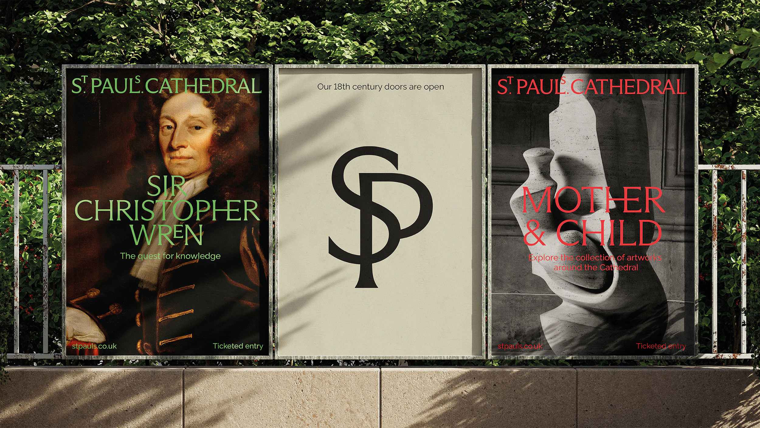
Pentagram’s identity for St Paul’s Cathedral does far more than make a historic institution look contemporary. It turns the cathedral’s history, stonecraft, typographic memory and civic role into the structural basis of a new visual system. The result is not merely a refined logo, but a coherent identity that reorganises how the institution appears, communicates and is remembered.
One of the project’s strongest decisions is the way the wordmark reinterprets historical references without imitating them. The elevated “S” and “T”, inspired by typographic details found in the Cathedral Library, create a quiet but distinctive character. History is not treated as decoration; it becomes raw material for a new design decision.
Typography works as an expression of institutional personality rather than ornament. Arizona Flare brings together classical letterforms and contemporary serif details, while Raleway establishes a calmer secondary voice. The palette, drawn from stone, floors and mosaics, further connects the identity to the physical reality of the building.
The project is valuable because it demonstrates that strong identity for a cultural institution is less about attracting attention than about producing belonging, continuity and character. In this context, timelessness emerges when form and meaning genuinely support one another.
Design
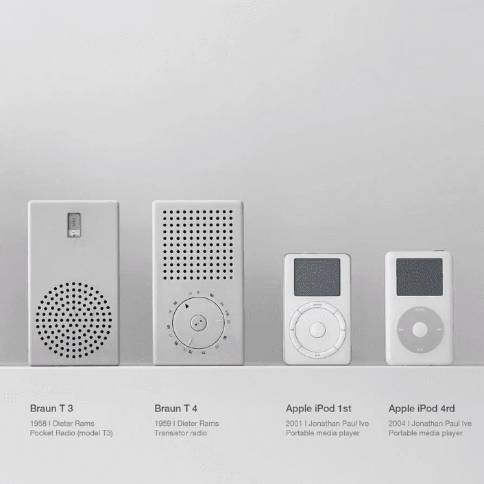
The resemblance between Dieter Rams and Apple is more than a question of formal borrowing. What truly matters is the design culture Rams developed at Braun — clarity, hierarchy, restraint, legibility and a calm user-centred aesthetic — and the way it found a contemporary reinterpretation at Apple, particularly during the Jony Ive era.
The kinship between the Braun ET66 and Apple’s calculator interface, or between Rams’s radios and audio devices and products such as the iPod and iPhone, is too strong to dismiss as coincidence. The connection is less about copying forms one by one than about proportion, surface logic, interface thinking, colour economy and the relationship established with the user.
What makes the comparison valuable is that it shows good design as a set of principles rather than a surface style. Rams’s “less, but better” becomes product clarity at Apple: an object should communicate its use, reduce cognitive noise and avoid allowing form to overpower function.
Yet an important difference remains. Rams’s design ethic is more explicitly tied to durability, longevity and a critique of consumption, while Apple does not always meet the same ethical standard. The relationship is therefore not only one of resemblance, but also of tension — and that tension makes the comparison more revealing.
Design
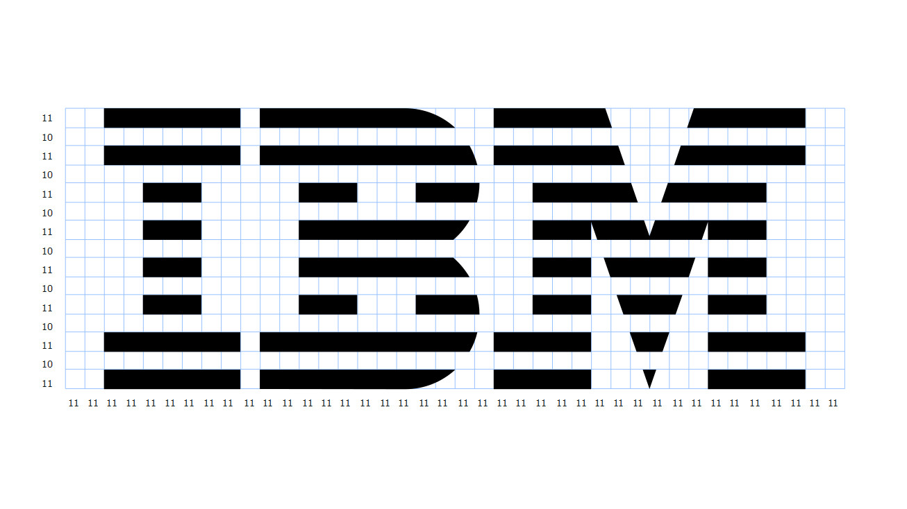
A logo’s timelessness has less to do with how striking it looks at first sight than with how clearly it can preserve its identity over time. Paul Rand’s IBM 8-Bar mark is one of the strongest examples. Its basic form has remained essentially unchanged since 1972, which is a result not only of recognition but of formal discipline.
What makes the mark interesting is that its apparently simple structure is optically very precise. Eight horizontal bands construct the letters through rhythm and negative space rather than through conventional outlines. This gives the mark a sense of technology, movement and continuity. Even the black and white bands are not mathematically identical in weight; IBM’s own guidelines describe optical adjustments that make them appear balanced. It is a reminder that strong identity depends on visual correctness, not merely geometric correctness.
A second condition of timelessness is independence from short-lived fashion. The IBM mark emerged from the modernist language of the 1970s, yet it does not feel trapped in that decade because its character comes from proportion, repetition and typographic structure rather than decorative effects.
Consistency matters just as much. Clear-space rules, scale relationships, positive and reversed versions, and careful optical adjustments protect the mark from arbitrary use. Over time, the logo becomes more than a graphic device; it becomes a carrier of institutional memory.
The real goal of a strong logo, then, is not to look modern. It is to be flexible enough to survive changing media while remaining distinctive enough not to lose its identity. Sometimes a few lines and the right proportions can achieve what layers of visual effect cannot: remaining recognisable, credible and current for decades.